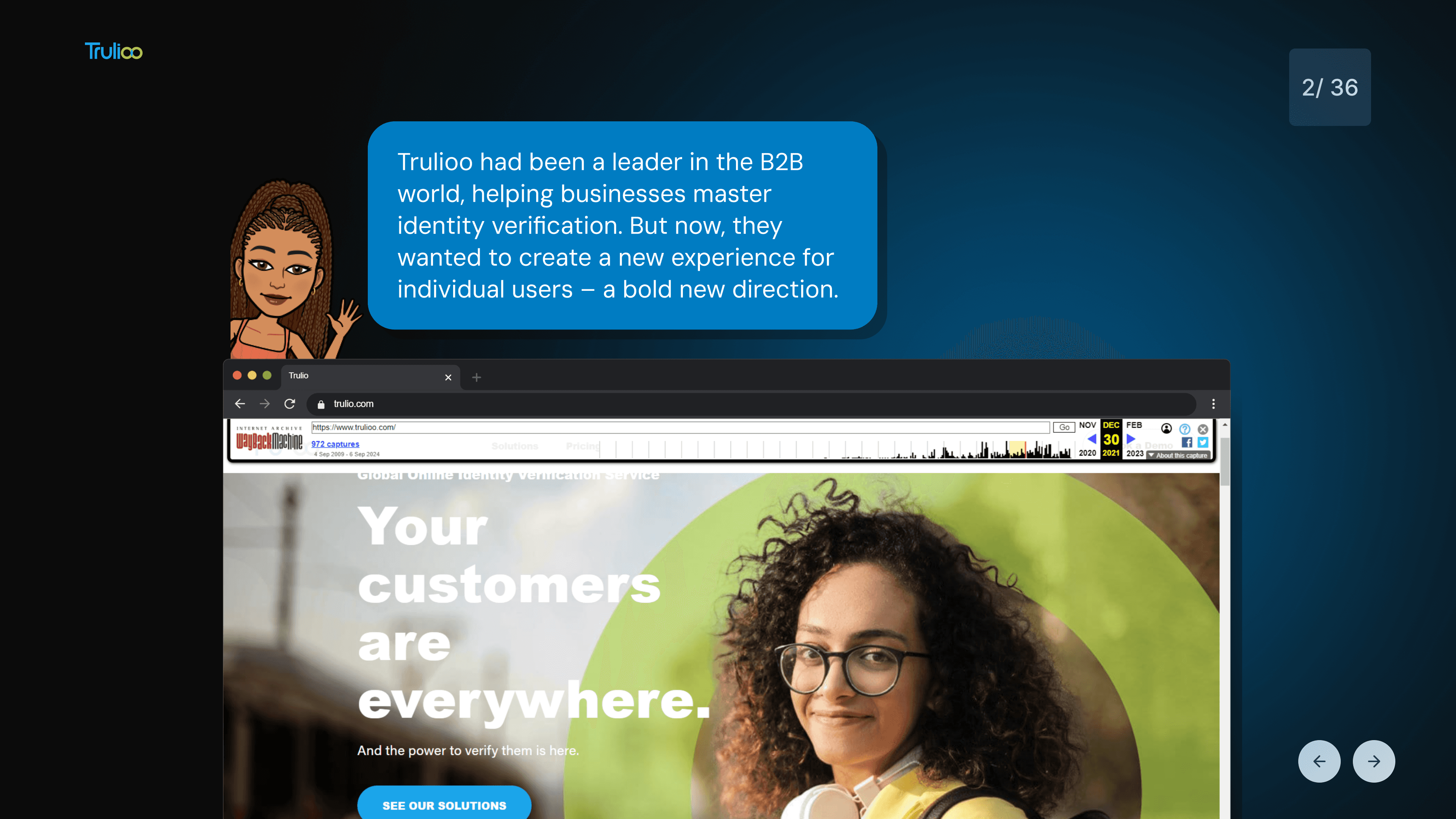
Branding Role in Trulloo's Navigator App Project

We were engaged by Trulloo to develop a dynamic brand identity and user experience for their groundbreaking Navigator app, marking the company’s strategic transition from B2B to B2C. The app, designed to simplify identity verification for individuals, required a visual language that balanced approachability with technological sophistication, ensuring users felt empowered and engaged.
Brand Identity Development
Our team crafted a cohesive brand strategy centered around playful yet purposeful characters and themes, iteratively designed to resonate with users. Key elements included:
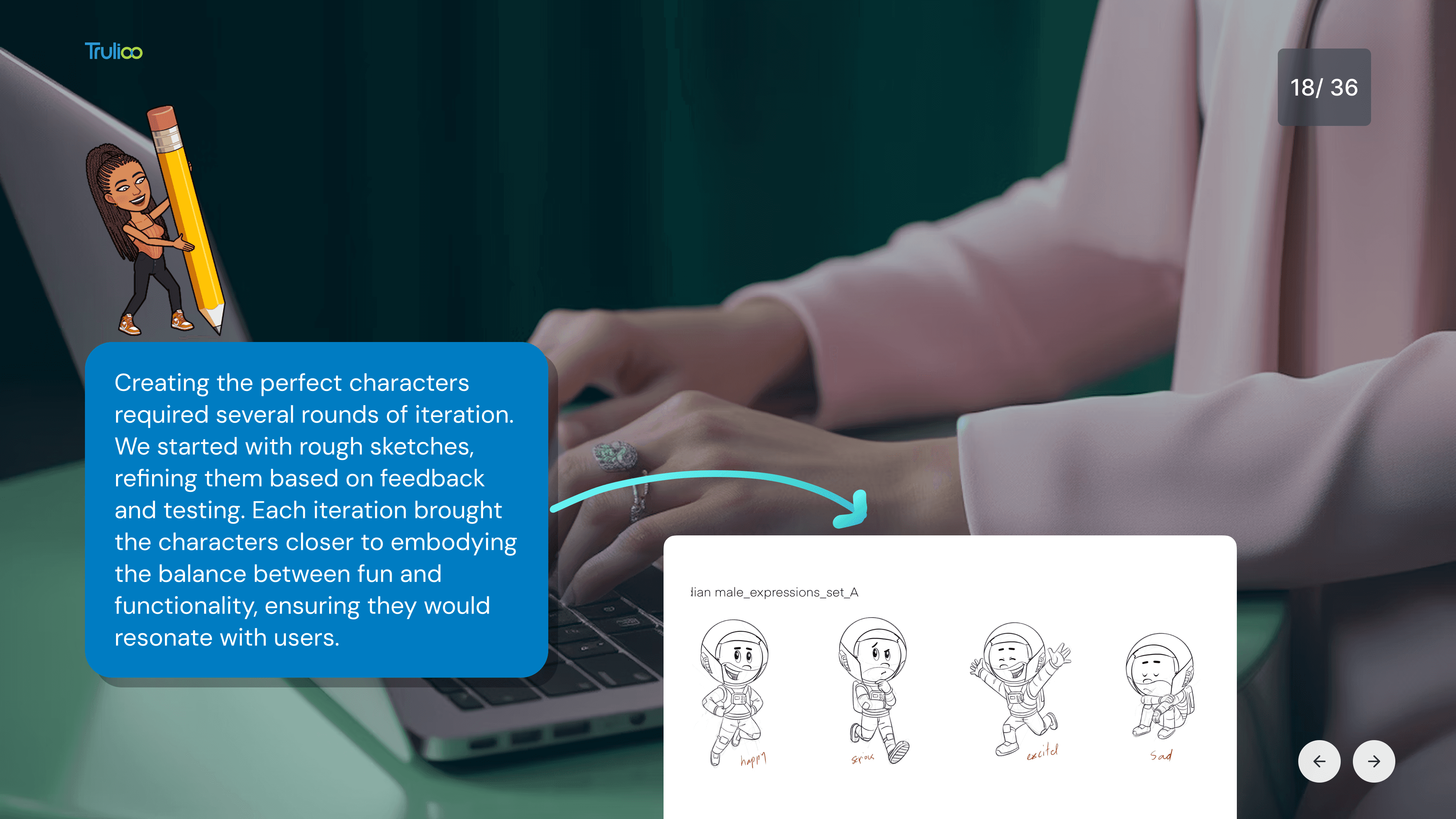
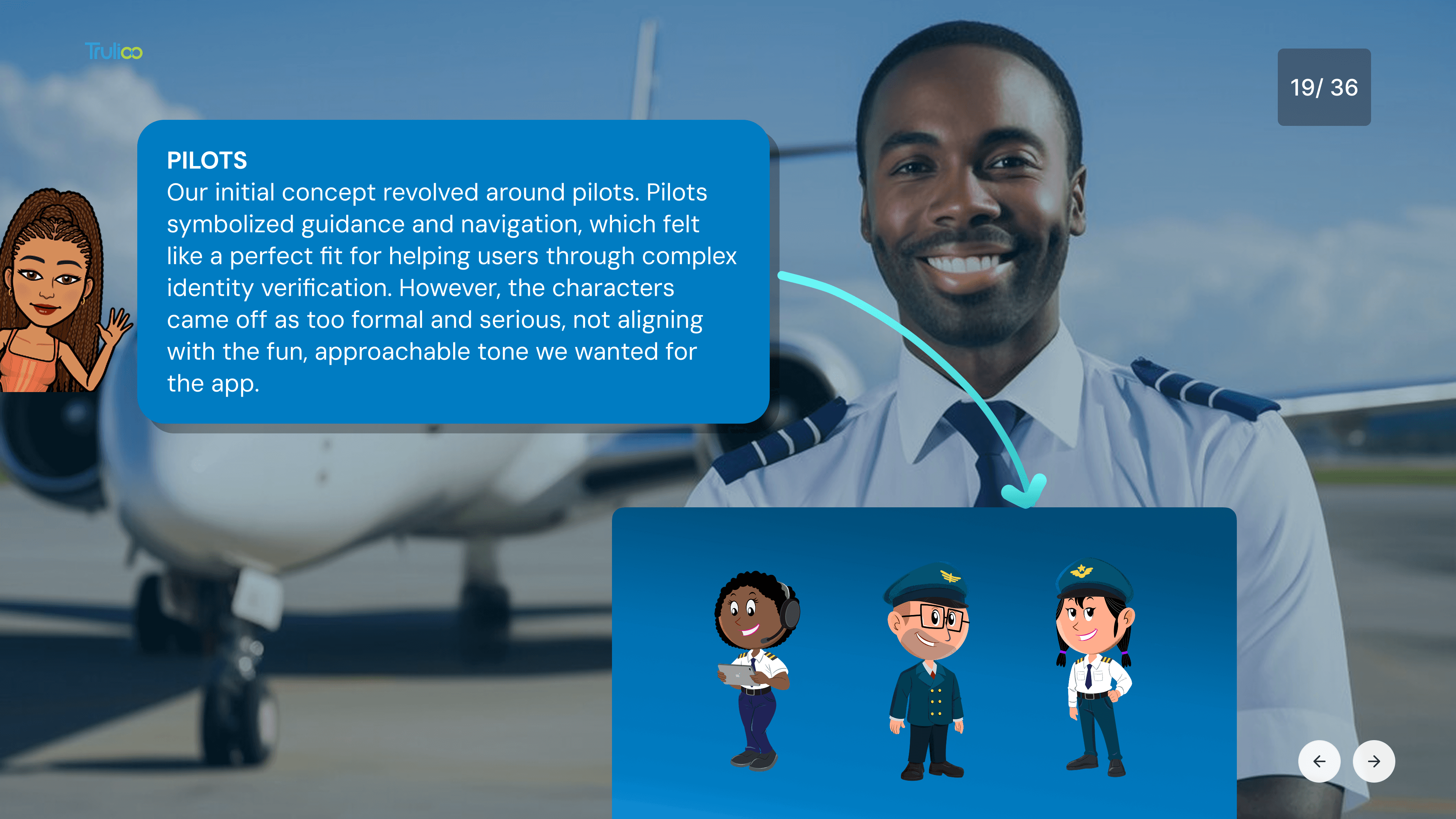
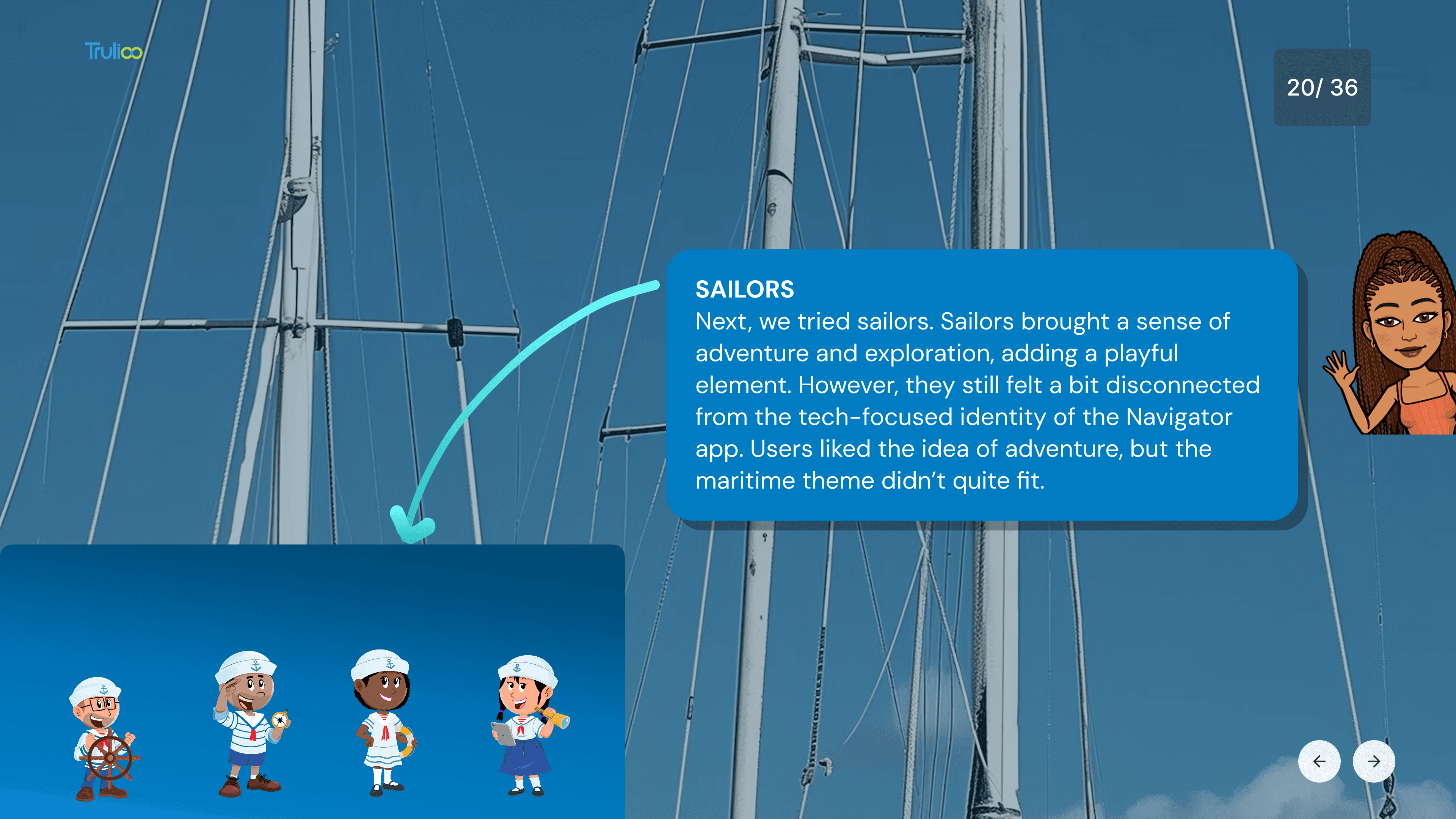
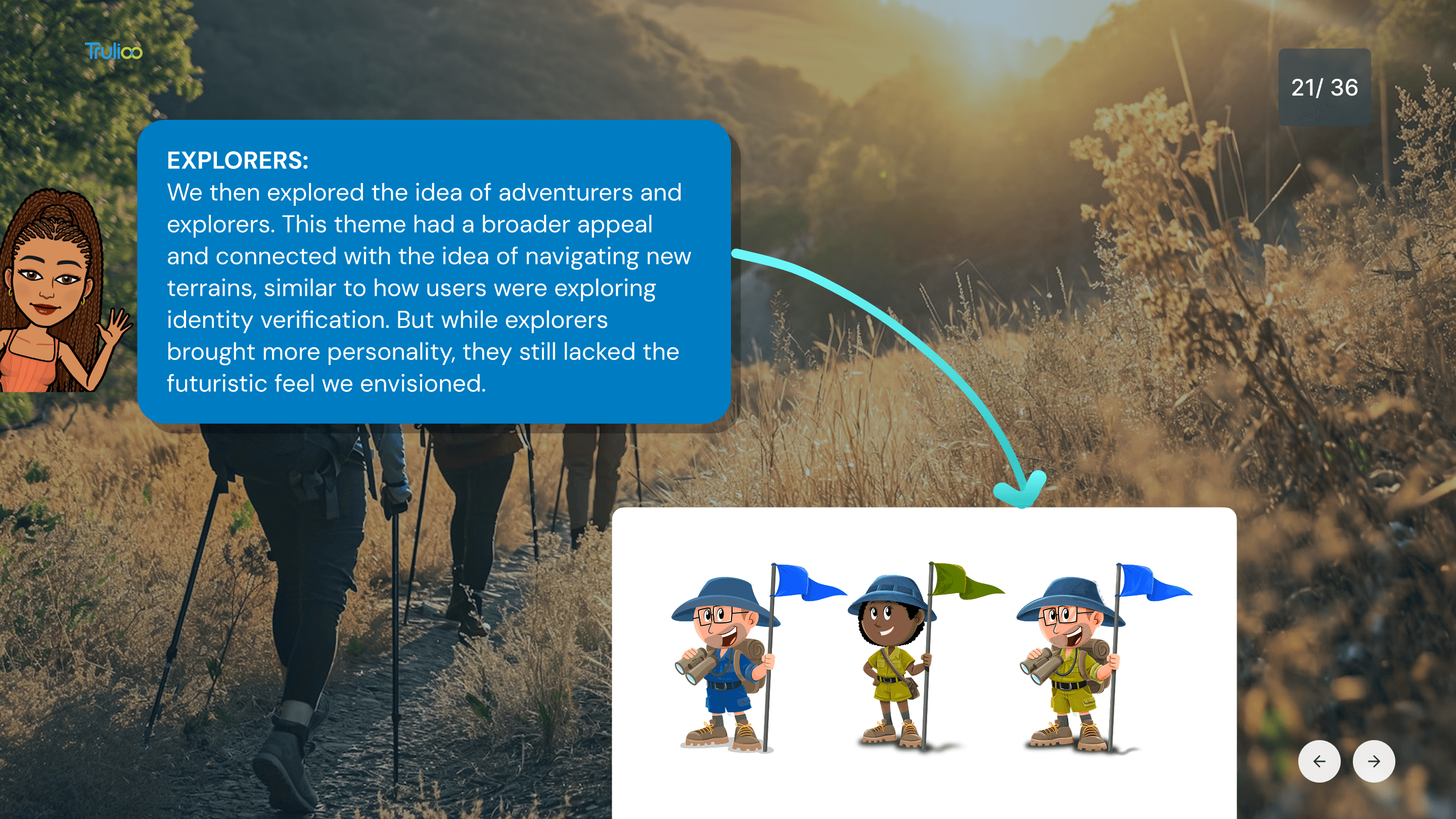
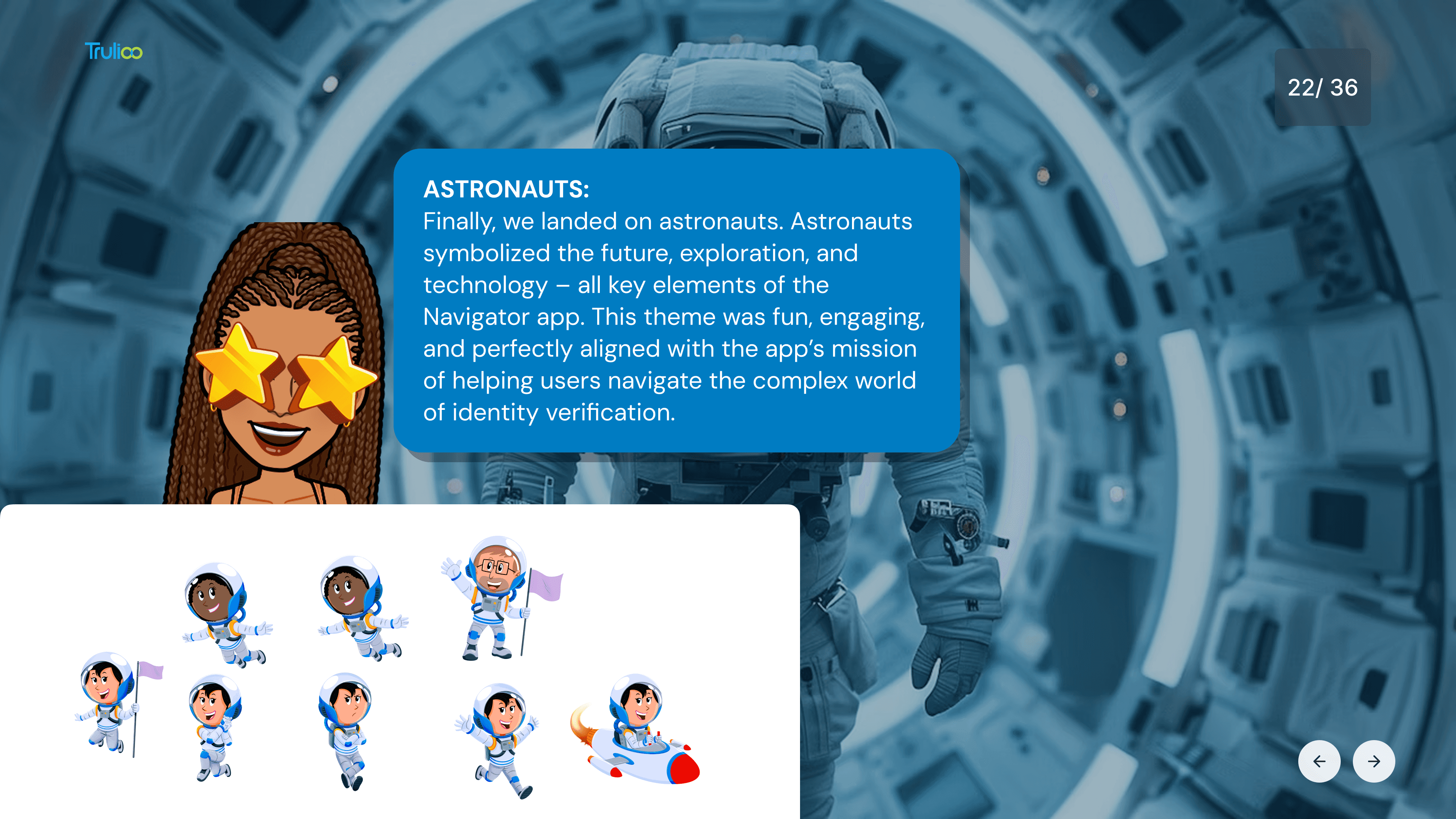
Character Design: A series of evolving personas—pilots, sailors, explorers, and ultimately astronauts—were developed to symbolize guidance, exploration, and futurism. Astronauts emerged as the final choice, embodying the app’s mission to navigate complex verification processes while aligning with themes of technology and innovation.
Visual Tone: A vibrant and friendly aesthetic was prioritized to counterbalance the technical nature of identity verification. This included expressive character expressions, a modern color palette evoking energy, and clean typography to ensure clarity.
Thematic Consistency: The astronaut theme unified the app’s narrative, leveraging space exploration as a metaphor for navigating new digital frontiers.
Design Process & Strategy
The project involved rigorous iteration and user feedback to strike the right balance between fun and functionality:
Character Iterations: Initial concepts (pilots, sailors) were refined to address tone mismatches. Explorers added adventure but lacked futurism, leading to the final astronaut theme that combined approachability with tech-forward symbolism.
User-Centric Focus: Characters were designed to act as guides, transforming a serious task into an engaging journey. Expressive animations and relatable personas made complex processes feel accessible.
Visual Storytelling: Abstract graphic elements and a cohesive style guide reinforced the app’s identity, ensuring consistency across onboarding screens, tutorials, and interactive features.
Outcome
The rebranding successfully positioned the Navigator app as a user-friendly gateway to identity verification. The astronaut characters became iconic symbols of Trulloo’s innovative shift, fostering emotional connections with users and driving adoption. The cohesive design language elevated Trulloo’s brand presence in the B2C space, demonstrating how strategic branding can simplify complexity and turn functional tools into delightful experiences.
This project underscores our ability to merge creativity with strategic objectives, delivering brand identities that resonate across audiences and amplify our clients’ market impact.